
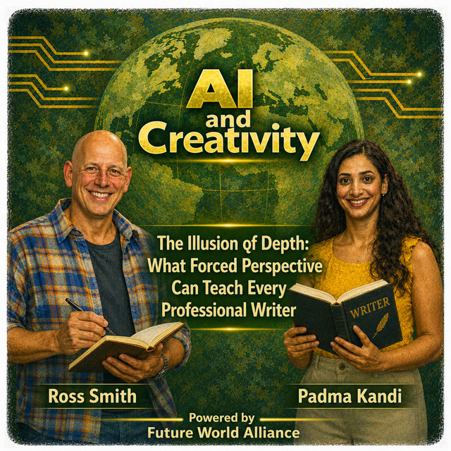
The Illusion of Depth: What Forced Perspective Can Teach Every Professional Writer
Stand at the base of the Leaning Tower of Pisa on any given afternoon and the scene is the same: hundreds of tourists, arms outstretched, carefully positioning…
Show notes
Stand at the base of the Leaning Tower of Pisa on any given afternoon and the scene is the same: hundreds of tourists, arms outstretched, carefully positioning their hands to “catch” a medieval tower they are standing forty feet away from. The photos are absurd. They are also perfect. Nobody is fooled. Everybody is delighted. And every single one of those photos required its photographer to make a series of precise, intentional decisions about angle, distance, and framing before a single image was captured.
That is not tourism. That is design.
Forced perspective, the technique of manipulating apparent size, scale, and depth through deliberate positioning, is the engine behind some of the most compelling visual experiences ever created. Disney Imagineers built Cinderella Castle’s upper spires progressively smaller so the eye perceives a structure far taller and more distant than it actually is. Peter Jackson rendered the Shire’s hobbit holes in meticulous, tactile detail so audiences would believe in an entire world built on that foundation. Spielberg positioned a boulder and an actor at precise distances from a camera so that a manageable prop became a geological force bearing down on Indiana Jones at terrifying speed.
Every one of those techniques translates directly to the page. The most effective business documents, technical specifications, white papers, and non-fiction writing don’t simply convey information, they stage it. And the writers who understand staging consistently outperform those who merely understand facts.
Here are six principles, borrowed from the world of cameras and theme parks and cinema, that will change how professional writers approach every document they produce.
Principle One: Scale Is Never Absolute
The first thing forced perspective teaches is that nothing has inherent size. Objects only appear large or small relative to what surrounds them. A person looks like a giant crushing a tiny car, or a traveler cradling an ancient tower, entirely because of deliberate positioning, not because of any property the objects themselves possess.
In Elf (2003), Will Ferrell appears to dwarf his entire elf family not through digital effects but through careful staging. Actors playing elves were placed farther from the camera on elevated platforms while Ferrell stood closer. No technology. No trickery. Just position. The audience accepted it instantly because the relationship between objects felt true, even when the absolute scale was fiction.
Business writers face exactly this challenge every time a number appears in a document. A $200,000 budget line is a bargain or an outrage depending entirely on what surrounds it. Present it beside the $2 million annual cost of the problem it solves, and it reads like relief. Present it beside last year’s $50,000 spend with no explanation, and it reads like a crisis. The number hasn’t changed. The frame has.
Disney Imagineers understood this at an architectural level. Main Street U.S.A. is constructed at full scale on the ground floor, the level guests actually walk through and touch, and progressively smaller on the upper floors that exist only to be seen from a distance. The grandeur isn’t built into the structure. It’s implied by the relationship between levels. Effective executive summaries work the same way: the most important finding gets full-scale treatment, rendered in specific, unambiguous language. Background context gets the upper floors, present, but progressively compressed.
Most business documents invert this completely. Pages of methodology. Half a paragraph of actual recommendation. The tower built upside down.
Try this GenAI prompt: “I need to present a $175,000 investment in a new cybersecurity platform to an executive team that is focused on cost reduction. Write an executive summary opening that establishes the measurable cost of the current security gaps, in staff hours, incident response costs, and regulatory risk, before the investment figure appears. Make the $175,000 feel like the responsible choice, not the expensive one.”
Principle Two: The Lens Decides What Feels Close
A camera collapses distance. It flattens a three-dimensional world into a two-dimensional image, which is precisely why forced perspective works, objects miles apart appear to touch. The lens has no depth perception, and the skilled photographer exploits that limitation completely.
In Raiders of the Lost Ark (1981), Spielberg used this principle to make a relatively modest prop boulder appear to bear down on Harrison Ford with crushing inevitability. The boulder was smaller than it appeared. Ford was positioned closer to the camera. The lens compressed the gap between them into nothing, and the audience felt the proximity as visceral threat.
Professional writers have the same tool: point of view. The distance between the narrative voice and the reader’s daily experience determines how urgent, relevant, and actionable any piece of information feels.
“The platform provides real-time analytics capability” is written from a great distance, institutional, passive, abstract. “Your team sees performance data the moment it changes, no waiting for end-of-day reports to find out the morning’s campaign already burned through its budget” covers the exact same ground from six inches away. The fact is identical. The proximity is not.
Scorsese mastered narrative distance in Goodfellas (1990), positioning the audience entirely inside Henry Hill’s experience, charmed by the camaraderie, seduced by the money and the lifestyle. The film then does something remarkable: it slowly, imperceptibly moves the viewer off that mark without their awareness, until they find themselves looking at the same events from a completely different angle. The story hasn’t changed. The vantage point has. The discomfort is the whole point.
Every professional writer should ask the same question Scorsese asked: who is standing on the mark, and what does the world look like from exactly where they’re standing?
Try this GenAI prompt: “Here is a paragraph from a technical specification written in standard passive institutional voice: [paste your paragraph]. Rewrite it three times, once optimized for a non-technical executive deciding whether to approve funding, once for the project manager responsible for delivery, and once for the engineer who will implement it. Show specifically what language changes between each version and explain in one sentence why each change was made.”
And this one: “I’m writing a quarterly business review for a leadership team that tends to read only the first two paragraphs before moving to questions. Rewrite the following update [paste update] so that the single most important insight, the one that changes how they should think about next quarter, appears in the first three sentences, written at the reading level of a smart, busy non-specialist.”
Principle Three: Build the Ground Floor at Full Scale
Peter Jackson understood that an audience will believe in an entire world if the part they can touch feels completely real. The Shire’s hobbit holes were rendered in extraordinary tactile detail, the worn wood of the round doors, the weight of hand-forged hinges, the smell of pipe-weed suggested by props placed just within frame. The grandeur of Minas Tirith was suggested and implied above that foundation. Audiences believed in the vast city because the street level was indisputably, physically true.
Disney Imagineers applied the same logic to every land they built. The facades guests walk past on Main Street U.S.A. are full scale at eye level, with authentic period details at the height a person would naturally notice. The upper floors, seen but never touched, shrink progressively. The illusion holds because the ground floor never lies.
In professional writing, the ground floor is whatever the reader will directly act on: the recommendation, the requirement, the finding, the decision point. That layer must be rendered at full scale, concrete, specific, and completely unambiguous. Everything above it, the context, the background, the methodology, the historical rationale, can be progressively less detailed. But if the ground floor is vague, the entire structure collapses regardless of how well the upper floors are constructed.
Try this GenAI prompt: “Here is a technical specification section that buries the actual system requirements inside paragraphs of architectural background and historical context: [paste your section]. Restructure it using this rule: every requirement the engineering team will directly implement appears first, written with complete precision and no passive voice. All context and rationale follows, summarized in no more than three sentences per concept. Flag any requirement that is currently ambiguous enough that two engineers might implement it differently.”
And this one: “I have written a strategic recommendation document that my manager says ‘buries the lead.’ Here is the document: [paste document]. Identify the single most important recommendation, rewrite it as a standalone opening paragraph that could survive being read in complete isolation, and then reorganize the remaining content so it supports rather than precedes that recommendation.”
Principle Four: Hide the Machinery
Every forced perspective photograph has a backstage. The awkward crouch on wet cobblestones, the twelve rejected angles, the passersby who walked through the shot. The magic depends entirely on the audience never seeing the setup. Disney’s theme parks are built on this principle at a structural level, underground service corridors run beneath the Magic Kingdom so that cast members, deliveries, and operational infrastructure never surface inside a themed land. The machinery is vast. The guest never feels it.
Kubrick applied the same discipline in The Shining (1980). The Overlook Hotel’s sets were deliberately constructed with architecturally impossible spatial relationships, rooms that couldn’t coexist, corridors that opened onto impossible vistas, so that audiences felt a persistent, sourceless wrongness without ever being able to name it. The machinery was invisible. The effect was total.
Business writing violates this rule constantly and confidently. Documents that narrate every step of their own research process, hedge every finding with methodological caveats, and surface every analytical assumption in the body of the text don’t appear more rigorous. They appear less certain. The scaffolding distracts from the building.
The rule is not complicated: the body of any professional document shows the destination. The appendix shows the route, for those who need to verify it. A finding stated with precision and quiet confidence reads like expertise. The same finding wrapped in visible scaffolding reads like someone hoping the reader won’t push back.
Try this GenAI prompt: “Here is a research report section that over-explains its methodology and hedges its conclusions to the point of obscuring them: [paste section]. Rewrite the body so the finding appears in the first sentence, stated as a confident declarative claim. Create a clearly labeled ‘Methodology and Assumptions’ section below it that contains all the process detail, written for a reader who wants to verify the work rather than one who needs to be convinced by it.”
Principle Five: Plant the Horizon Where the Reader Should Look
Imagineers plant progressively smaller trees toward the far ends of themed lands, pushing the visual horizon outward and making finite spaces feel boundless. The eye follows the tree line and willingly invents the distance beyond it. It is misdirection dressed as landscaping.
Hitchcock used this principle as his primary narrative weapon. In Psycho (1960), he spent an entire first act carefully tending a false horizon, a story about embezzlement, a woman running from her old life, before redirecting completely. Every detail he planted was genuine and meaningful. It simply pointed the wrong direction. When audiences realized what had happened, the disorientation was the experience.
In professional writing, controlling where the reader’s attention travels is a structural responsibility. The most important finding must occupy the position of greatest visual and structural emphasis. A project status report that opens with a green performance dashboard while the critical budget risk lives in paragraph seven has planted its horizon in the wrong field. The executive reads the green. The decision gets made without the information it needed.
This principle also carries its most serious edge. Documents that deliberately misdirect, that frame losses as gains, soften hard numbers into impressionistic language, or use visual complexity to obscure a weak conclusion, erode trust completely when the reader eventually catches on. And readers always eventually catch on. The technique is powerful. Its ethical application is non-negotiable.
Try this GenAI prompt: “Here is a project status report that leads with positive metrics while a significant delivery risk is mentioned briefly in the middle section: [paste report]. Restructure it so the risk is the first substantive item, stated plainly, with the specific decision or action required called out in a single sentence. Rewrite the positive metrics as supporting context that follows, rather than leads. The reader should be able to act on this report after reading only the first paragraph.”
And this one: “Review this quarterly report for any language that softens, obscures, or buries a negative finding: [paste report]. Flag each instance, explain what the reader is likely to understand versus what the writer appears to actually mean, and suggest a rewrite that is direct without being alarmist.”
Principle Six: The Illusion Only Works From One Spot
Every forced perspective photograph has a single correct vantage point. The tourist catching the Eiffel Tower in her palm must stand in exactly the right place, face exactly the right direction, at precisely the right distance. Her companion two feet to the left sees only a woman with her arm extended at nothing. The illusion was designed for one person, positioned with intention.
Cinderella Castle looks most magnificent from the end of Main Street U.S.A., at a specific distance, at roughly adult eye level. Walk around to the backstage areas, or approach it from an angle the Imagineers didn’t design for, and it becomes a different structure entirely, smaller, more mechanical, less magical. The experience was engineered for a reader standing in one place.
Every professional document has a designed reader. A technical specification written for a senior architect approving a system design is a fundamentally different document than one written for the junior developer implementing it, even when both describe the exact same system. An annual report written for institutional investors occupies different ground than one written for employees or community stakeholders. Writing one document for all of these audiences simultaneously almost always means it works well for none of them.
Before writing a single word of any professional document, complete this sentence in writing: “This document is written for [specific person or role] who needs to [specific action or decision] by [specific date or moment] and currently believes [specific assumption this document will change].” Every decision that follows, level of technical detail, document length, structural hierarchy, tone, flows from that single sentence. The mark is set. Write for the person standing on it.
Try this GenAI prompt: “Before I write this document, help me define my reader. Here is what I am trying to communicate: [paste your core message]. Here are the possible audiences who might read it: [list your audiences]. For each audience, describe: what they already believe about this topic, what decision they need to make, what would make them trust this document, and what single thing they would need to read to feel the document was worth their time.”
And this one: “I have written this document for a general professional audience: [paste document]. Identify the three places where the document most clearly fails a specific type of reader, either too technical for a non-specialist, too vague for a practitioner, or too abstract for an executive, and rewrite each section for the reader type most likely to need it.”
Conclusion: The Reader Is Always Standing Somewhere
The tourists in Pisa know perfectly well they are not holding up the tower. Executives reading a white paper know they are being persuaded. Engineers reading a specification know that someone made choices about what to include and what to leave out. That awareness doesn’t diminish the power of good staging. It only raises the standard for it.
What forced perspective teaches across every medium, photography, cinema, theme park design, and professional writing, is that the human mind is not a passive receiver of information. It is an active collaborator. Give it the right details, position it with care, hide the scaffolding, align the horizon, and it will construct meaning, confidence, and clarity on its own.
The writer’s job in any professional context is not to include everything. It is not to demonstrate the full extent of the research, or to protect against every possible misreading, or to hedge against every conceivable objection. The job is to stand the reader in exactly the right spot, and then trust that from that position, the right conclusion becomes the only visible one.
Clarity is not the absence of complexity. It is complexity staged so well that the reader never has to feel it.
Latest episodes
 July 28, 2026 · 7 minThe Gap that won’t CloseWhy AI Might Be the Best Tool We’ve Ever Built for Staying Curious
 July 23, 2026 · 5 minWhat J.R.R. Tolkien Can Teach Us About AI and CreativityOverview
 July 15, 2026 · 6 minSteering Away From the Middle: What the Great Creators Teach Us About Using AIIn 1965, driving his family toward Acapulco for a holiday, Gabriel García Márquez is said to have heard the opening voice of One Hundred Years of Solitude…